Debunking the Climate Scam
Billions of Dollars -
Greedy Green Corporations -
No Warming For Two decades -
Bought and Paid For Organizations
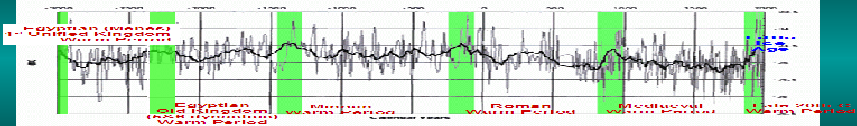
5000 Years Of Climate Change From Greenland Ice Cores
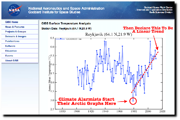
How They Lie With Graphs
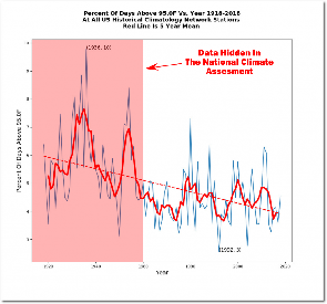
HEAT WAVES
Below is from: https://realclimatescience.com/extreme-
Dramatic increase in heat waves:
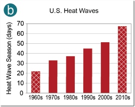
But here is the whole story: They ignore inconvenient data that shows there are less heat waves than before man emitted much CO2! Of course the name of this is lying.
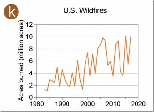
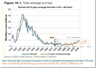
WILD FIRES
Below is from: https://realclimatescience.com/extreme-
Dramatic Increase in fires:
Here is what they left out (their lie):
Hot Days
Below is from: https://realclimatescience.com/fraud-
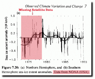
DECLINING SEA ICE
Below is from: https://realclimatescience.com/fraud-
They usually show from 1978, but earlier data exists and shows less ice!
Here is a page full of climate graphs that show today’s climate is NOT UNUSUAL when
compared to history BEFORE man emitted much CO2: https://realclimatescience.com/hiding-
SEA LEVEL
https://realclimatescience.com/2020/02/more-
SEA TEMPERATURE (one site only)
Presumed from: https://realclimatescience.com/
![[Image]](_wp_generated/wp7b25152b_05_06.jpg)
![[Image]](_wp_generated/wp286c1243_05_06.jpg)
![[Image]](_wp_generated/wpc61694ee_05_06.jpg)
This trick works both ways:
How They Make Vanishing Snow From Constant Snow
More Examples
https://co2coalition.org/2022/01/17/global-
Two graphs -


A more appropriate, less misleading way to graph the same temperature data is to use a vertical range that’s fairly typical of the weather people commonly experience. That’s a scale they’ll understand.
In the United States, except when air currents rapidly move a much warmer (or cooler)
air mass from one locale to another, the diurnal (daytime high to nighttime low)
temperature range is typically around 5.6°C (10°F) in humid locales, but around 22.2°C
to 27.8°C (40°F to 50°F) in arid to semi-
It would seem reasonable, then, to depict global temperature anomaly data on a vertical scale of, say, halfway between the low and high ranges, i.e., 16.7°C (30°F). And, to complete our avoidance of psychological scare tactics, we’ll jettison the color scheme and use a neutral color.
How would NOAA’s data for 1880 to 2016 look depicted that way?
FROM: https://www.climatedepot.com/2024/08/02/analysis-
| Warming Stopped |
| NOAA Data |
| NorthWest |
| Oregon |
| Washington |
| Extreme Weather |
| Past Was Warmer |
| NASA: 30's Hotter |
| HistoryOFAlarmism |
| Central England |
| Temperature History |
| MultiProxy |
| treemometers |
| Northwest Passage |
| Acidification-Ball |
| Acidification-Fulks |
| Acidification-Idso |
| Selected Emails |
| CRU Emails - html formatted |
| CRU Emails Simple Format |
| CRU Emails UnFormatted |
| DCPS paper |
| CRU_Files_Notice |
| False Deadlines |
| Hockey Stick Links |